Commercial Photography and Graphic Design
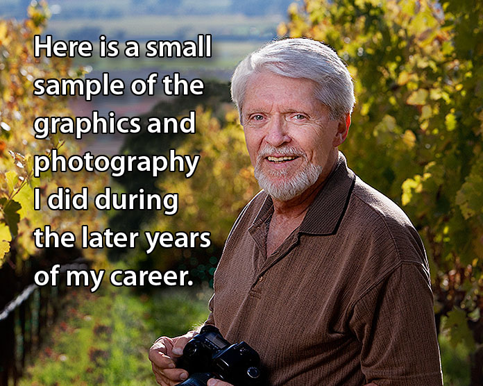
I've been retired for more than ten years, but I did enjoy my career, and people still ask me questions about various aspects of it. Here's a very condensed autobiography of my career.
By the way, here are nine shortcuts to frequently visited places on this website.
Selling a product or service requires images and words displayed in an attractive, compelling manner. That's what I offered. Potential customers must see a company's wares as being distinctive from those of the competition. Even when the product is in the customers' hands or they've left the sales floor, the graphics they have continue to represent the company.
| I designed and created: |
|
|
- Advertising, Instructional
and Promotional Videos
- Performance Videos
- Brochures & Booklets
- Magazine Advertisements
- Point of Purchase Displays
- Catalogs & Manuals
|
- Sell Sheets & Folders
- Rack Cards & Hang Tags
- Product Packaging
- Email Blasts
- Architectural Signage
- Logos & Stationery
- Newsletters
|
- Announcements
- Calendars
- Postcards & Mailers
- Greeting Cards
- Posters & Banners
- Menus & Placemats
... whatever you need.
|
| and I provided: |
|
|
- Script Writing
- Video Production
- Video Editing
- Product Photography
|
- Bottle Shots
- Lifestyle Photography
- Event Photography
- Food Photography
|
- Interiors
- Executive Portraiture
- Studio or Location
... whatever you need.
|
Brochures and fliers, booklets and newsletters
These eye-catching, quality printed pieces depict some of the work I did in the wine industry. My skills increased sales of whatever products or services a company offered. People comment on the depth and richness of the documents I created. The viewer's eye is always drawn to the product.
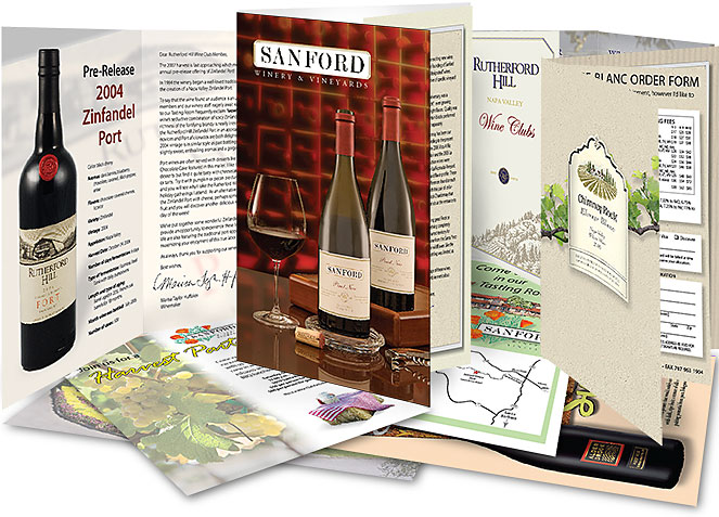
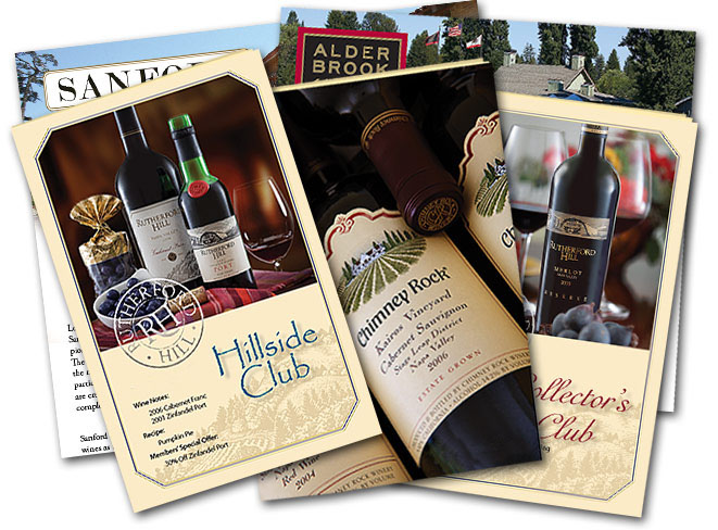
I conceived layouts for newsletters, such as these for several wine clubs, and provided compelling typography and original custom images for each newsletter issue.
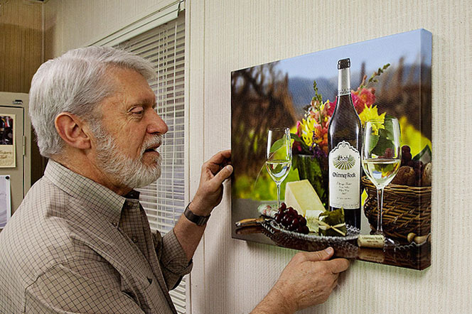
I created a sales brochure for Chimney Rock Winery's Elevage Blanc. Their tasting room manager liked my cover photo so much that he asked me to have 16"x 20" canvas prints made of it so they could sell them in his tasting room. |
|
 |
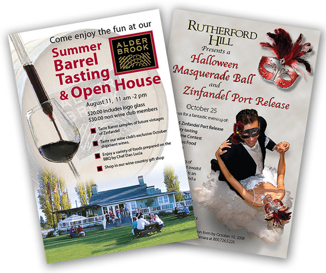
I enjoyed inventing graphics
which drew people to
special events. Even before the viewer read the text, they were sold on the event by the graphic imagery.
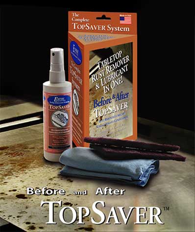
Package design, from concept to die cut
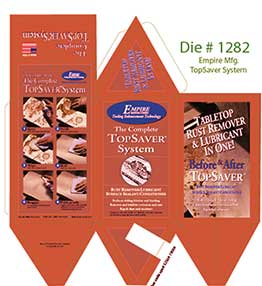
I created this triangular box and bottle for Empire Manufacturing's TopSaver. The distinctive package shape gives more "shelf face," permitting more sales information to be displayed. Since the die-cut package has a crease down the center of the right panel, it was the perfect spot for a large before/after photo demonstrating the product's effectiveness.
|
| To show how easy their product was to use, I took step by step photos and put the instructions on the back of the box. |
|
 |
 |
|
Catalog production
The CB Tool Group offers thousands of products and accessories in their retail stores. I worked with them to produce this phone book size catalog, enabling them to put descriptions and photos of their products in the hands of their customers. |
|
 |
Products, places and food
The tasting room staff at Chimney Rock Winery asked me to create a "beauty shot" photo of their three primary red wines which they could sell as 18" x 24" posters.
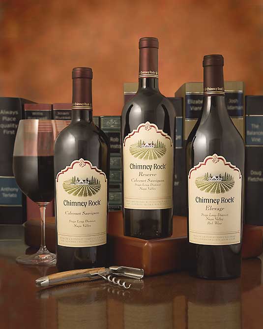
In order to have the posters be as sharp as possible, I took the picture in three parts: bottom, middle and top. I combined these three images in Photoshop, achieving a sixty-four megapixel image. I used friends' lawbooks for the background, but replaced the lettering with titles and "authors" appropriate to the winery.
I liked the final image, so I've had a 24"x30" print made to hang in my office. In addition to the posters, the image has been printed on greeting cards and may be purchased as a glass serving platter in their tasting room.
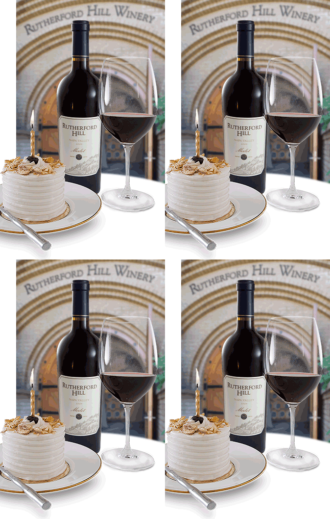
I photographed some small cakes to illustrate the birthday greetings emailed to wine club members each year with a birthday discount code.
At the request of members of the Photozo digital photography forum, I've written a short tutorial explaining how the candle animation was created. The tutorial can be found about half way down the list on my Tutorials Page. |
 |
| |
 |
A recipe is far more enticing with an actual photo of the food. Food photography requires special techniques and just the right equipment. People often look at one of my food photos and say, "That really makes me hungry!" For me that's the ultimate compliment. If they had simply admired the techniques I used, I wouldn't have accomplished my goal.
I was in the vineyards at dawn capturing candid photos of the grape harvest for use in publicity. These hard workers pick at a hectic pace from about 6:30 a.m. until 8:30 am.
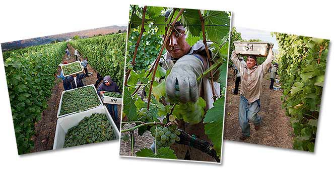
The Terlato Wine Group had three of my harvest photos made into 5'x8' banners to decorate a harvest celebration dinner. I was really pleased with how well they
turned out.
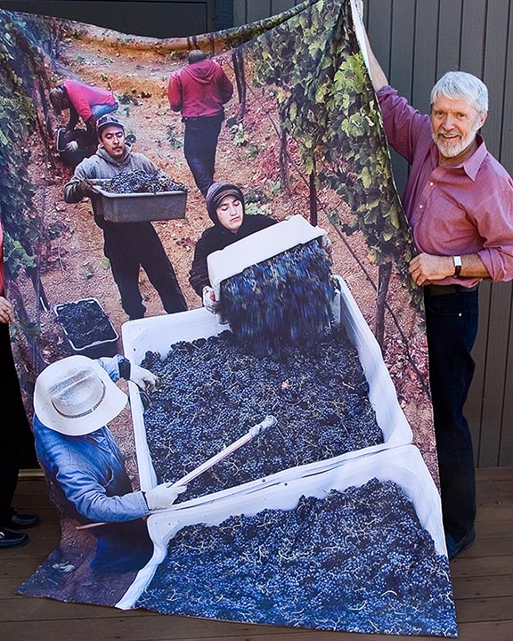
See
other photos and the rest of the story here>>.
 |
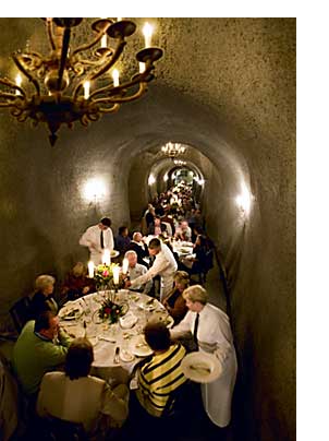 |
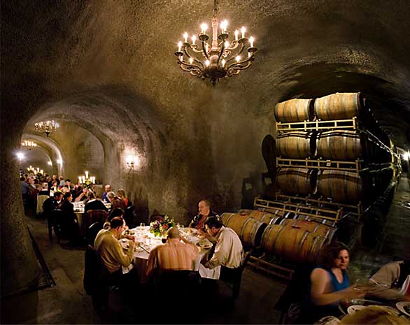
Rutherford Hill Winery offers catered dinners in their wine aging caves. I took photos of some of their events for use in print material and on the web.
The
caves are quite dim, as many elegant restaurants, so the shutter speed in these photos is nearly a full second.
I had to combine four extreme wide-angle photos to create the photo above, to let the viewer see down the length of two of the tunnels.
|
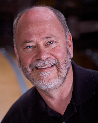
Executive portraiture and personnel photos
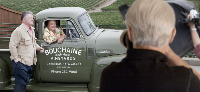
I created publicity portraits of corporate executives and other key personnel. Here I'm creating one of several portraits of Gerret and Tatiana Copeland, owners of Bouchaine Winery. |
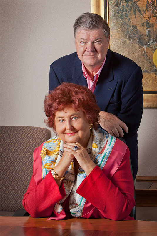
Owners of Bouchaine Winery, Gerret and Tatiana Copeland
|
Terlato Wine Group
Vice President
of Winemaking,
Doug Fletcher
|
|
 |
|
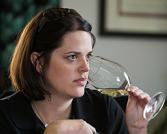
Rutherford Hill Winemaker, Marisa Taylor
|
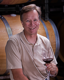 Alderbrook Winemaker,
Bryan Parker |
|
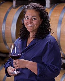
Chimney Rock Winemaker,
Elizabeth Vianna
|
I'm happy using available light (as that candid photo of Marisa), or using studio lights as I did in the photos taken in the dark barrel room.
Composite photography
Often the image in my mind or in the client's imagination simply wasn't possible. That's when I combined images to yield what we had in mind.
Over time, I developed a library of images which could be used for a client for many diverse purposes. In this case, a photo I'd taken years previously made the perfect background to display a bottle of Chimney Rock wine.
Bottle photgraphy is a combination of artistry and technique. In this case, we didn't want their beautiful landscape and clouds to be reflected in the bottle, since it would distract from their label, so I created the product photo in the studio where I'm able to completely control the lighting and reflections.
I lit the bottle with extremely soft light and made sure the bottle was the only thing in focus. This draws the viewer's eye directly to the product in the scene. |
|
|
I removed the white background from behind the studio scene and inserted my photo of the building, blurring it just enough to make it fit in with the studio product shot.
The winery's iconic tasting room building in the background is the white building on their label. The client's "impossible" photo is ready for use as a catalog cover, a poster, on their web site or for use in social media. |
|
|
|
This image and others like it generated thousands of dollars in sales which would otherwise have gone to their competitors. |
>> More
Graphic Design and Photography>>
